CMS+ Clear+
Remove filters in bulk, including search text from Search+.
Key Features
Clear all filters or target specific ones.
Target one or multiple Collection+ lists.
Clear search text from one or more Search+ components.
Controls
ClearThis control is used to trigger its clearing function. Learn how it works.Active Filters(Optional) A list of items containing sub-controls:Collection IDUse the sameIDnumber as the Collection+ you want to reset. Set up your Collection+ first.All FiltersBy default clears all filters.FieldsIf not clearing all filters, list select CMS fields.
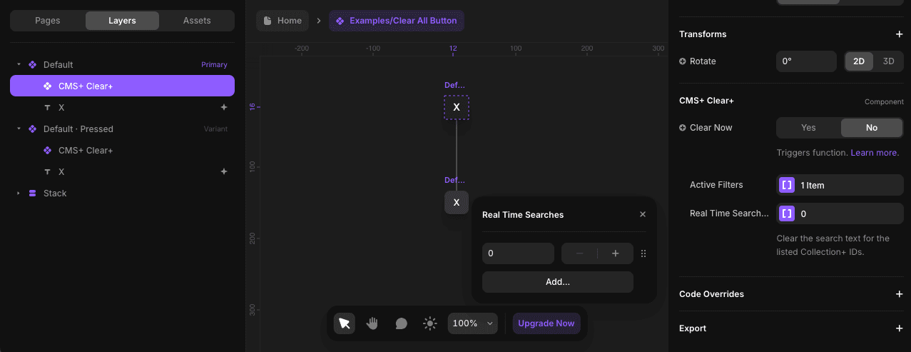
Real Time Searches(Optional) A list of Collection+ IDs to clear its real-time search text.
Step-by-Step Setup
Integrate your component with Clear+. Learn how.
Note
Clear+ was developed to work with the "Pressed" variant of your component.

Configure the Clear+ controls in the primary variant.
For the
Active Filterslist, adding an item will have you target a Collection+ via itsID, then choose to clear all filters or select filters.
For the
Real Time Searcheslist, every item is a Collection+ ID you want to target.
Both list controls are optional, meaning you can choose to use one or both. To remove an item from a list, simply right-click on it.
Override
Clearin the "Pressed" variant.
This will trigger its function when your component is pressed. Learn more about triggering functionality.
Creative Use Case
Clear+ pairs seamlessly with Search+, making them perfect for building a fully functional and user-friendly search bar within a custom frame. This combination allows users to search and clear results effortlessly, all within a design that feels familiar and intuitive.