
Key Features
- Clear all filters at once or target specific ones
- Target one or multiple Collection+ lists
- Clear search text from one or more Search+ components
Controls
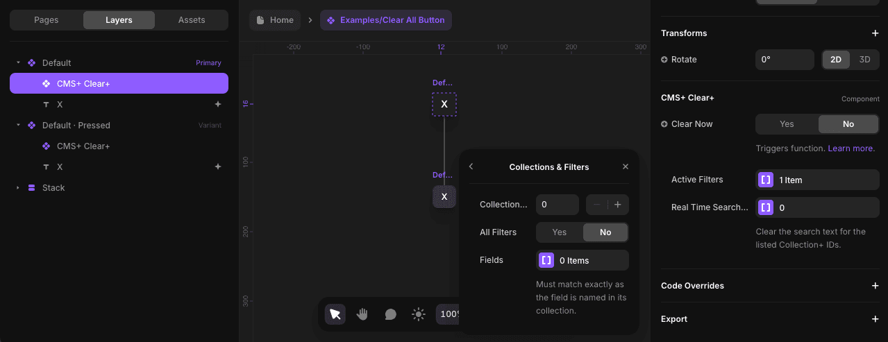
Clear- This control is used to trigger its clearing function. Learn how it worksActive Filters(Optional) - A list of items containing sub-controls:Collection ID- Use the sameIDnumber as the Collection+ you want to reset. Set up your Collection+ firstAll Filters- By default clears all filtersFields- If not clearing all filters, list select CMS fields
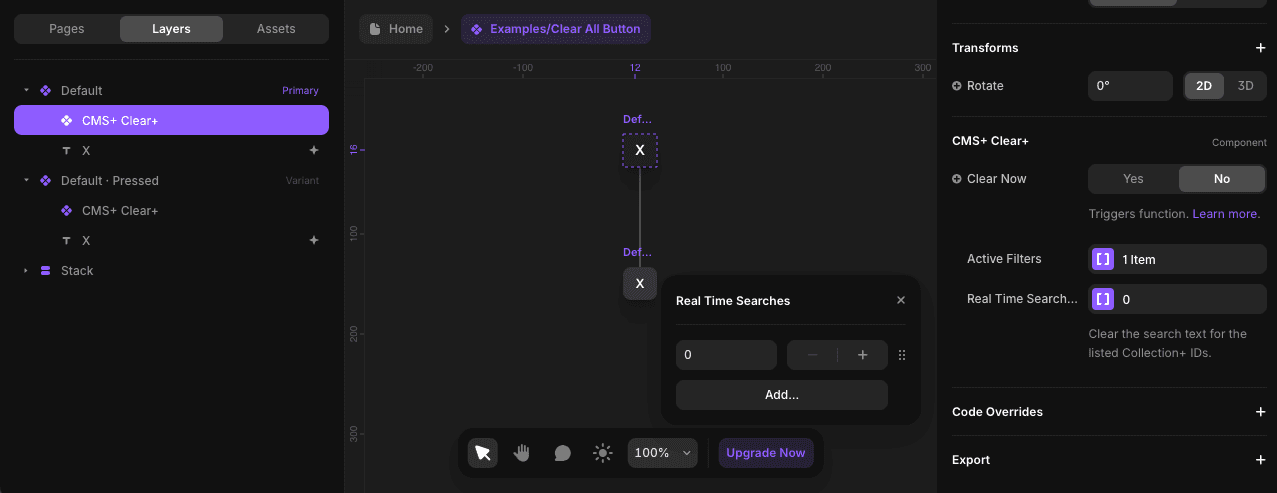
Real Time Searches(Optional) - A list of Collection+ IDs to clear its real-time search text
Step-by-Step Setup
1. Integrate with Your Component
Integrate your component with Clear+. Learn how.
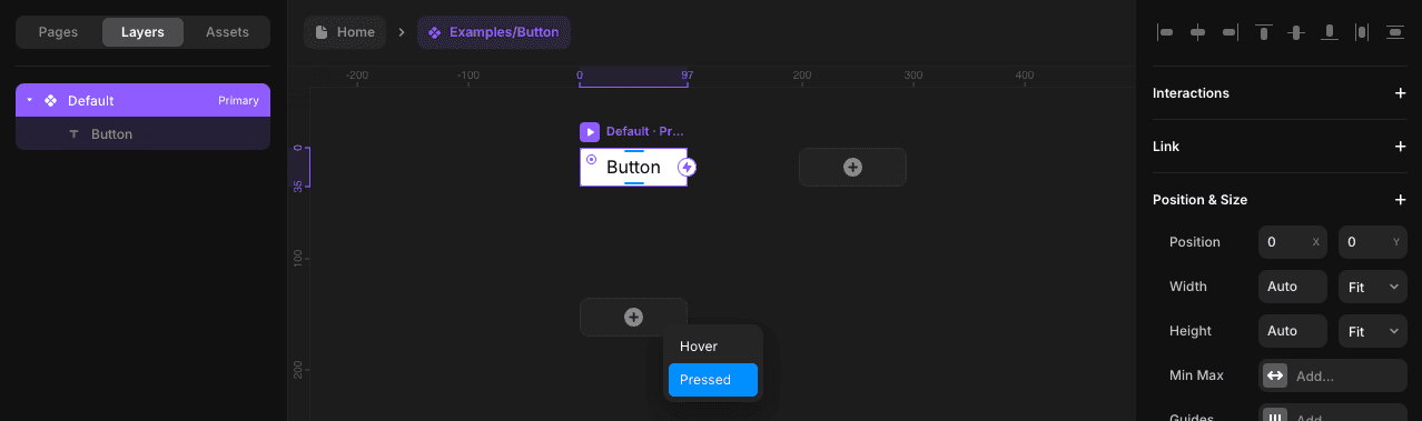
Note Clear+ was developed to work with the "Pressed" variant of your component.
2. Configure Controls
Configure the Clear+ controls in the primary variant.
For the Active Filters list, adding an item will have you target a Collection+ via its ID, then choose to clear all filters or select filters.
For the Real Time Searches list, every item is a Collection+ ID you want to target.
Both list controls are optional, meaning you can choose to use one or both. To remove an item from a list, simply right-click on it.
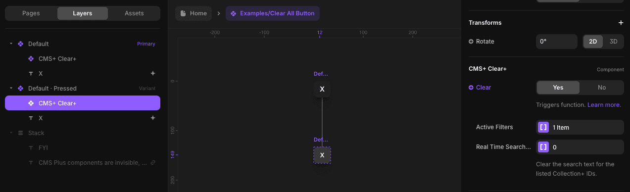
3. Override in Pressed Variant
Override Clear in the "Pressed" variant. This will trigger its function when your component is pressed. Learn more about triggering functionality.
Creative Use Case
Clear+ pairs seamlessly with Search+, making them perfect for building a fully functional and user-friendly search bar within a custom frame. This combination allows users to search and clear results effortlessly, all within a design that feels familiar and intuitive.
Related Components
- Search+ - Real-time search functionality
- Collection+ - The core list manager
- Filters+ - All filter types