
Trigger Functionality Within Components
Each CMS Plus component is purpose-built for a specific function. When you drop it on the page, it behaves like a native Framer feature and starts working immediately. You can also embed it inside your own components and trigger its function via variants for more intentional, interactive behavior.
Handle Functionality via Variant Transitions
The pattern is simple:
- Create a new component and insert a CMS Plus component
- Configure the CMS Plus component in the primary variant
- In the other variant, simply override its trigger control
Each trigger control is named after its CMS Plus component. For example, Filter+ uses the
Filtercontrol, and Clear+ uses theClearcontrol. Check each component's documentation for detailed guidance.
Example: Custom Toggle with Filter+
Here's a custom toggle integrated with Filter+ Option. The primary variant, Inactive, has Filter+ Option configured, while the Active variant overrides the Filter+ trigger control, Filter, to Apply. Learn how to integrate CMS Plus into your components.
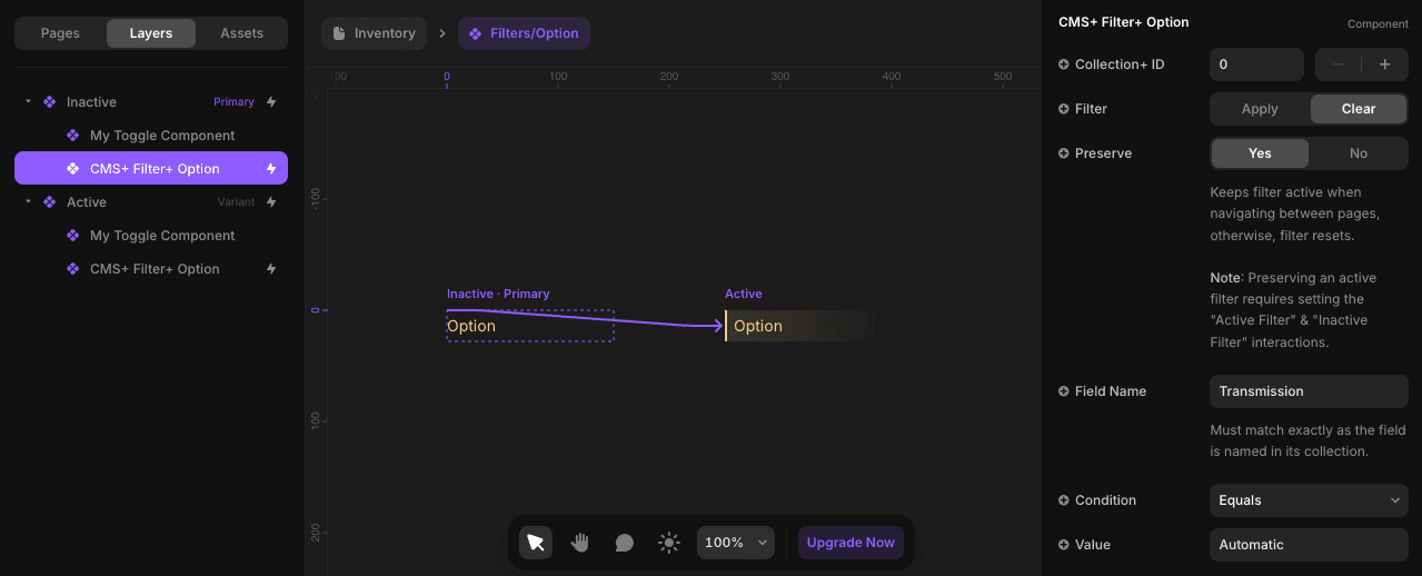
↑ Inactive Variant: Configure all properties in the primary variant.
↓ Active Variant: Only override
Filterto trigger the function. Overrides are identified by their purple text.
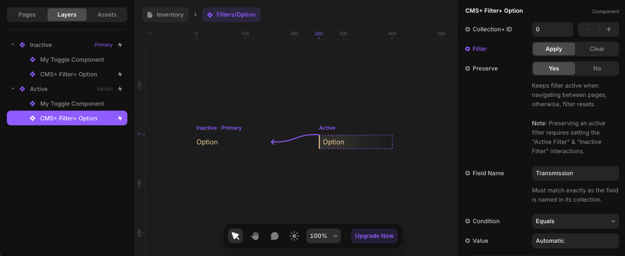
By using Framer's variant transitions, toggle-driven components enable dynamic interactivity, giving users precise control over filtering, sorting, and other actions. Depending on the CMS Plus component, the name of the control you override will differ—always check the component docs for the exact control name.
Component-Specific Triggers
Different CMS Plus components use different trigger controls:
- Filter+ - Uses
Filtercontrol (Apply/Clear) - Clear+ - Uses
Clearcontrol - Sort+ - Uses
Ordercontrol (Ascending/Descending/Off)
Always check the specific component documentation for the exact control name and options.