
Key Features
- Search across one or many Collection+ components
- Search within all supported fields, or limit search to selected fields
Currently, Plain Text and Slug CMS fields are supported.
Controls
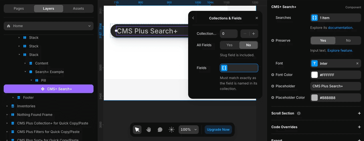
Searches- A list, each item contains these sub-controls:Collection ID- Use the sameIDnumber as the Collection+ you want to link. Set up your Collection+ firstAll Fields- By default, search across all supported CMS fieldsFields- If not searching across all fields, list select CMS fields
Preserve- Enable autofill if input text exists. Read more about preservingFont- Set the font stylesFont Color- Set the color of the user inputPlaceholder(Optional) - Display custom text if input is emptyPlaceholder Color- Set the color of the placeholder textonInput- Optional property accessible via a code override. See Developer API section below
Step-by-Step Setup
1. Insert onto Your Page
Insert Search+ onto your page.
2. Add Items to Searches
Add items to Searches:
- Set the target
Collection+ IDnumber - Choose to search within
All Fields, or not - If not searching within all fields, add items to
Fieldsfor select ones
To remove an item from a list, simply right-click on it.
3. Configure Remaining Controls
Configure the rest of the controls to complete.
Developer API
The onInput prop lets you pass a custom function to capture and respond to changes as a user types in the input field. It receives the same onChange event that a native HTML <input> would.
onInput?: (event: React.ChangeEvent<HTMLInputElement>) => void;
This is useful if you want to implement custom logic with the user's input. If you are new to code overrides, visit Framer's documentation. Here is a basic example:
// search_plus_override_example.tsx

import { forwardRef, type ComponentType } from "react"

export const withUserInputOnChangeCapture = (Component): ComponentType => {
  return forwardRef((props, ref) => {
    // your custom function
    function handleInput(inputEvent) {
      // get the input value
      const inputValue = inputEvent.target.value;
      // do something with inputValue
    }

    // Note: Search+ handles input internally with logic, debouncing and validation.
    // This onInput prop provides raw access to the input event as the user types.
    props.onInput = handleInput;

    return <Component ref={ref} {...props}/>
  })
}
Creative Use Case
Search+ can be added to any frame and fully customized to match your design vision. For example, you can pair it with a CMS Plus Clear+ component to create a fully custom, functional search bar. Clear+ can be configured to target the same Collection+, allowing users to perform real-time searches and easily clear results—all within a design that's uniquely tailored to your project.
Related Components
- Collection+ - The core list manager
- Clear+ - Reset searches
- Count+ - Display search result counts